The Americans with Disabilities Act (ADA) has shared font guidelines for compliance, but they do not list approved fonts. The design focuses on clean and clear font styles that users can differentiate. Specifically, this blog will give you a comprehensive guide on how to choose a font for ADA-compliant Signage in 2025
Here’s an unofficial list of popular fonts that work well for ADA signage:
- Arial
- Avant Garde
- Avenir
- Calibri
- Century Gothic
- Franklin Gothic
- Frutiger LT
- Futura Std
- Gill Sans Std
- Helvetica
- Interstate
- Lato
- Lucida Sans
- Montserrat
- Myriad Pro
- Open Sans
- Optima
- Raleway
- Roboto
- Source Sans Pro
- Swiss 721 BT
- Tahoma
- Trebuchet MS
- Verdana

Table of Contents
Many specifications require that signs meet certain criteria to be considered ADA-compliant. One of the most important things to consider is your choice of font.
If the font is hard to read, visitors might struggle to find their way around the building or get the information they need. Additionally, failure to meet ADA compliance can lead to significant fines and lawsuits.
Why ADA-Compliant Fonts Matter
ADA-compliant fonts help businesses avoid legal problems. They make signs readable for everyone. These fonts create a better experience for all visitors. So it’s important to know how to choose a font for ADA-compliant signage.

Legal Risk of Non-Compliance
Businesses face lawsuits when they ignore ADA signage rules. Courts have ruled against businesses for poor font choices. Proper font selection prevents these legal problems.
Accessibility for People with Visual Impairments
People with visual impairments need proper signage to navigate buildings without risk. ADA-compliant fonts help blind users read raised characters with their fingers. These fonts create spaces where everyone can find the information they need.
Better Readability Results Better User Experience
Good fonts create better experiences for all users. They help everyone read signs better. Simple, high-contrast fonts make information easier to find. They allow anyone to read signs while moving through a building.
ADA Font Rules and Requirements (How to Choose a Font for ADA-Compliant Signage)
ADA signs assist people with visual impairments. The Americans with Disabilities Act has clear rules on font style, size, and height. You must meet these criteria to achieve ADA compliance.

The guidelines for ADA-compliant fonts include:
Raised Character (Tactile) Guidelines
Tactile signs need raised characters. This helps people with visual impairments read using their fingers. These characters must be 1/32 inch from the background and cannot be higher than 1/8 inch.
Visual Character Guidelines (Informational & Directional)
Visual signs show information and directions, but do not need raised letters. These signs must meet contrast rules.
Required Fonts: Sans Serif vs. Serif

ADA rules prefer sans-serif fonts over serif fonts. Sans-serif fonts have clean letter shapes. Serif fonts can confuse people because of their small decorative parts. These decorative lines cause problems in both raised and visual signs.
Style Restrictions (No Italics, Oblique, or Script)

Characters must follow ADA standards. They cannot be italic, oblique, script, or decorative to a great extent, or in unusual forms. These stylized fonts make letters harder to read.
Case Requirements (Uppercase Only for Tactile)

The characters in tactile signs must be uppercase letters only. The uppercase letters have distinct shapes that fingers can tell apart.
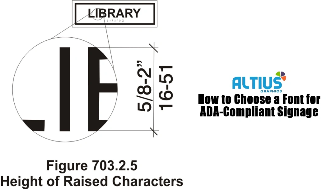
Character Height
Measure character height from the baseline. It must be at least 5/8 inch (16 mm) and no more than 2 inches (51 mm). This measurement relies on the height of the uppercase letter “I”.
Font Size, Spacing, & Viewing Distance
Font size and spacing significantly impact the effectiveness of your signs. They provide specific formulas for achieving this.
Copy Height Based on Viewing Distance
ADA guidelines use a simple ratio. A sign people can read from 20 feet away needs letters at least 2 inches tall.
Letter Spacing and Stroke Thickness
The uppercase letter “I” must have a stroke thickness of no more than 15 percent of its height.
Minimum and Maximum Font Sizes
Tactile letters must be at least 5/8 inch tall and no more than 2 inches tall. Smaller letters are hard to feel. Larger letters are too big for fingers to read.
Character Proportions

Choose fonts where the width of the uppercase “O” is at least 55% and at most 110% of the height of the uppercase “I”.
Character Spacing
Proper spacing between letters can improve legibility. Remember, visually impaired people will touch the sign.
Measurement Point
Character spacing should be measured from the nearest points of nearby raised characters in a message. Do not include spaces between words. This is standard.
Rectangular Cross Sections
The characters are rectangular. The space between each raised character must be at least 1/8 inch (3.2 mm). It can’t be more than four times the width of the raised character stroke.
Other Cross Sections (e.g., rounded, domed)
For characters with different cross sections, use these spacing rules for raised characters:
- At the bottom of the cross sections, it must be at least 1/16 inch (1.6 mm). It should not exceed 4 times the width of the raised character stroke.
- The top of the cross sections must be at least 1/8 inch (3.2 mm). It should also be no more than four times the width of the raised character stroke.
Separation from Borders/Elements
Separate characters from raised borders and decorative elements by a minimum of 3/8 inch (9.5 mm). It’s important to keep decorative elements from blocking the raised characters’ readability.
Line Spacing

The space between the baselines of raised characters must be 135% to 170% of their height. It ensures that signs with multiple lines of raised text have enough space between the lines. This way, someone can read them by touch.
Color Contrast and Background Selection
Color contrast affects how people with visual impairments can read your signs. The background elements used matter for readability.
Light on dark or dark on light

Light text on dark backgrounds and dark text on light backgrounds can work. It helps create a good contrast between the text color and the background. It makes signs glare-free and reduces eyestrain.
Contrast Ratios for Visual Clarity
ADA standards say text color must contrast with the background by at least 70%.
Avoiding reflective or glossy backgrounds
Shiny or reflective surfaces can negate good contrast ratios by creating glare. Glossy backgrounds look fine in controlled light. However, they can be hard to read because of light reflections.
Best Fonts for ADA-Compliant Signs (How to Choose)
Some fonts are more effective than others for ADA-compliant signage. These fonts have clear letter shapes, proper spacing, and excellent tactile readability. It makes them the best options for accessible design.
We have mentioned some fonts that best fit ADA-compliant signs.
Helvetica
Helvetica is the top pick for ADA-compliant signs. Its clean, geometric letters are easy to read, even at different sizes.
Verdana
Verdana was made for computer screens. It also works well for physical signs. The font has wide letterforms and generous spacing. This makes it easier to read, even at small sizes.
Futura
Futura has unique letter shapes thanks to its geometric design. This makes it great for tactile reading. Its clean, modern look appeals to contemporary buildings while meeting all ADA requirements.
Arial
Arial offers similar benefits to Helvetica. Its clear letter shapes and easy readability make it a great choice for organizations that care about accessibility.
Calibri
Calibri offers a softer, contemporary feel for ADA-compliant signage while ensuring excellent readability. The font has gentle curves and open letter spacing. This makes it look friendly while still being functional.
Frutiger
Frutiger was created for wayfinding, which makes it ideal for ADA-compliant signage. The font’s clear letter differences and sturdy construction ensure reliability in high-traffic areas.
Why do these fonts meet standards?
These recommended fonts have essential characteristics that make them ideal for ADA compliance. They have simple, geometric letter shapes. The stroke widths are consistent. There is generous space between letters. Similar letters look distinctly different.
Fonts to Avoid in ADA-Compliant Signage

Knowing which fonts to use is as crucial as spotting those to avoid. Some font features can make a font non-compliant with ADA rules, no matter how it appears.
Times New Roman
The serif design of Times New Roman creates many problems for ADA compliance. When raised, the small decorative strokes at letter ends can break off. This creates rough edges that make tactile reading uncomfortable. The serifs also create visual clutter that reduces contrast and clarity.
Comic Sans
Comic Sans exemplifies everything that ADA-compliant fonts should avoid. It has irregular letter shapes, inconsistent spacing, and a casual appearance. It undermines the effectiveness of serious accessibility signage.
Script and decorative fonts
Script fonts link letters together. This can make it hard to recognize each letter when reading by touch. Decorative fonts make things look busy and hard to read. They can also cause problems in manufacturing when raised.
Condensed or stylized fonts
Condensed fonts squeeze letters together. This reduces the space between them, making it harder to tell them apart. Stylized fonts change regular letter shapes. This can confuse readers who rely on sight and touch.
Balancing Branding and Compliance
Organizations often struggle to maintain their brand identity while meeting ADA requirements. Creative solutions allow both compliance and brand expression through strategic font usage.
Use brand fonts for visual characters only
Brand fonts can enhance visual signage elements that don’t require tactile reading. Headers, decorative elements, and supplementary information can maintain brand consistency. Use compliant fonts for essential wayfinding and identification text.
Maintain brand colors with compliant contrast
You can use brand colors for ADA-compliant signage. Just make sure they meet the contrast ratio rules. Color analysis tools help find out if certain brand color combos reach the 70% contrast ratio.
If brand colors don’t have enough contrast, you can adjust them a bit. This keeps both compliance and brand recognition intact.
Use ADA fonts for tactile/functional portions
The most effective approach separates functional signage elements from decorative ones. Room numbers, key details, and tactile elements must use compliant fonts. Designers can reserve brand fonts for visual enhancement and supplementary information.
ALTIUS Graphics is Here to Help

It is important to familiarize yourself with ADA guidelines to ensure your signs are considered ADA-compliant. Failure to follow these guidelines can lead to legal issues regarding non-compliance. Despite all of the complex restrictions, it is still possible to create stunning-looking signs that meet the requirements. If you’re still confused or have any questions about the process of creating ADA signage, ALTIUS Graphics is here to help. Contact us today.
FAQs on How to Choose a Font for ADA-Compliant Signage
Q1. What fonts are ADA-compliant for signage?
ADA-compliant fonts are typically simple, sans serif, and highly legible. While the ADA doesn’t list approved fonts, popular choices include Helvetica, Arial, Futura, Verdana, Frutiger, Calibri, and Avenir. These fonts offer clean lines, clear spacing, and high readability, making them suitable for tactile and visual accessibility.
Q2. What font size is required for ADA signs?
For tactile signs, characters must be between 5/8 inch and 2 inches tall, measured from the baseline of an uppercase “I”. For visual-only signs, the size depends on viewing distance; for example, 2-inch letters are required for a viewing distance of 20 feet.
Q3. Can I use decorative or script fonts in ADA signage?
No. Decorative, script, italic, or oblique fonts are not allowed on tactile signs. These styles reduce readability and create confusion for people with visual impairments. ADA guidelines require fonts that are simple, sans serif, and uniform in shape.
Q4. Are all signs required to use ADA-compliant fonts?
No. Only certain signs—like room identification, restroom, and exit signs—require ADA-compliant fonts with tactile features. Temporary signs, directories, and decorative signs don’t need to meet tactile font standards but should still follow visual contrast rules for accessibility.
Q5. Can I use my brand’s font on ADA signage?
Yes, but with limitations. You can use your brand font for visual elements that do not require tactile text. However, for tactile or functional parts of signage (like room numbers), you must use ADA-compliant fonts that follow spacing, size, and style guidelines.
Q6. What happens if signage doesn’t meet ADA font rules?
Non-compliance with ADA signage rules can lead to fines, legal action, and accessibility issues. Businesses may face lawsuits or government enforcement if their signage hinders accessibility. Following ADA font rules helps ensure inclusivity and protects against legal risk.
Read More
Debunking the Myth: Custom Signs Are A Costly Investment