Table of Contents
The selection of business sign colors is a strategic decision that increases your brand’s recognition. It is about psychology, not about looks.
People form an opinion of your business in 90 seconds. 62% to 90% judgment is based on color. The right sign colors attract more customers and build strong brand recognition.
Many business owners pick colors based on personal preference. They ignore proven strategies. This guide provides a science-backed approach to selecting the most effective colors for your business.
What is the best color for your business sign?
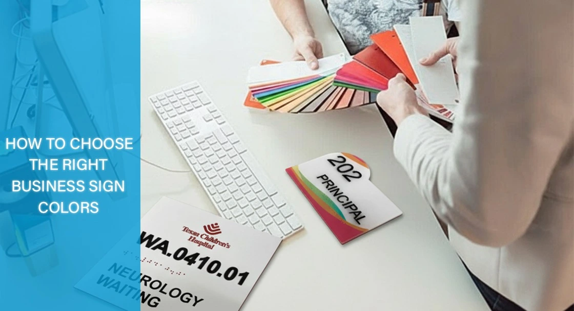
The best color for a business sign depends on your brand’s personality, industry, and, with high contrast for readability, such as white on a dark background. Here is a collection of the best business sign color guides to help you choose the most effective sign colors.
Blue: People associate blue with authority, trust, and security. It’s a good choice for professional services, healthcare, and tech companies. However, it is not recommended to use blue if you are trying to create urgency or appetite appeal.
Best for: Professional services, healthcare, financial services, and tech companies.
Avoid if: You’re trying to create urgency or appetite appeal.
Red: Red is associated with energy, urgency, and power. It is popular in the food industry because it can spark hunger. Red is utilized for restaurants, sales signs, or any call-to-action elements. It is advised to use it sparingly as too much can cause anxiety.
Best for: Restaurants, sales/clearance signage, emergency services, call-to-action elements
Avoid if: You want to convey calm, tranquility, or luxury.
Green: Green is associated with feelings of nature, health, and prosperity. It is particularly suitable for businesses in the health and wellness industry, environmentally conscious enterprises, and financial services.
Best for: Health/wellness businesses, eco-friendly companies, financial services, and outdoor businesses.
Avoid if: You’re in luxury retail or high-end services where sophistication matters more than earthiness.
Yellow: Yellow symbolizes happiness, optimism, and warmth. This color drives more attention. It is suitable for businesses targeting kids and budget-friendly services. Yellow should be used carefully as it can cause eye strain when used in large areas.
Best for: Children’s businesses, cheerful retail environments, warning signs, and budget-friendly services.
Avoid if: You want to project premium positioning, or if used in large areas.
Black: Black represents sophistication, power, and elegance. It is the favorite choice for luxury brands and fine dining. Black also helps other colors to stand out. It should be avoided by businesses aiming to appear approachable.
Best for: Luxury brands, fashion, high-end restaurants, professional services
Avoid if: You want to appear approachable or if your business targets families with children
White: White symbolizes simplicity, cleanliness, and innocence. It is ideal for minimalist brands and serves as a background to create high contrast.
Best for: Healthcare, minimalist brands, backgrounds for maximum contrast
Avoid if: The sole color choice (lacks personality and memorability)
Purple: Purple represents exclusivity and uniqueness. It is mostly used in luxury brands and creative services.
Best for: Luxury brands, beauty and cosmetics, creative services (design, art, fashion), spiritual/wellness businesses, and products that emphasize uniqueness or prestige.
Avoid if: You want to convey mass-market appeal, affordability, or approachability; industries focused on practicality (like budget retail, logistics, or everyday household services) where purple may feel too extravagant or out of place.
Pro Tip: Orange (a combination of red and yellow) represents warmth and excitement. It is used to promote fun and creativity in signage.
The Psychology Behind Business Sign Colors
A study shows the human brain processes color more quickly than text. Each color triggers a specific emotional response before we think about it. This helps a business express feelings like trust, energy, or luxury with no words needed.
Research has shown the impact of color on business outcomes.
- Color can increase brand recognition by up to 80%
- 84% of shoppers say that brand colors are the primary reason they buy a particular product.
Application of Business Sign Colors in Industry
Healthcare and Medical
Winning colors: Blue (trust), green (health), white (cleanliness)
Avoid: Red (associated with blood/emergency), yellow (can appear unsanitary)
Restaurants and Food Service
Winning colors: Red (appetite stimulant), orange (energy), yellow (cheerful)
Avoid: Blue (appetite suppressant), purple (rarely found in nature)
Professional Services (Legal, Financial, Consulting)
Winning colors: Navy blue (authority), gray (stability), black (sophistication)
Avoid: Bright colors that might appear unprofessional
Retail and Consumer Goods
Winning colors: Depends on positioning – bright colors for value, muted colors for premium. Strategy: Match colors to price positioning and target demographic
Technology Companies
Winning colors: Blue (innovation), gray (sophistication), white (clean/modern). Trend: Many tech companies use color gradients for a modern feel
A business sign’s colors can enhance its appearance and drive real business results.
The Research Behind Color Impact
A University of Loyola, Maryland study found that color increases brand recognition by up to 80%
Even more impressive? A study by slideshare.net revealed that 84% of shoppers say brand colors are the primary reason they buy a particular product.
The ALTIUS Color Selection Framework
At ALTIUS Graphics, we follow a proven method to choose the right interior business sign colors by moving beyond personal preference.
- A – Assess Your Brand Personality: We determine a business’s core traits first. We ask questions like Is it professional or playful? Is it traditional or innovative? The choice of colors should reflect these characteristics based on the answer found.
For example, a law firm might select navy blue to convey professionalism. A children’s dentist picks bright and friendly colors. They could include blue to express trust.
- L – Look at Your Location and Environment: A sign works well in its surroundings. In a busy street, a sign should be bold, high contrast colors to stand out. In a rural area, it can use colors that match the natural surroundings.
- T – Target Your Specific Audience: Different colors respond to different demographics. Younger audiences like signs in school and colleges like bold colors. Older audiences prefer traditional and sophisticated tones. Cultural and gender factors also play a role in color perception.
- I – Identify Your Primary Business Goal: When designing a sign, it is important to consider the desired action it should encourage. Warm colors, such as red or orange, promote immediate actions, like walk-ins. In contrast, blue and green are ideal for professional services. For luxury goods, black or gold convey a sense of exclusivity and premium quality.
- U – Understand Contrast Requirements: This is important to ensure a sign is readable. It is advisable to use high-contrast color combinations, such as dark blue on a white background or black on yellow. Low contrast combinations, such as light yellow text on a white background, should be avoided to enhance visibility and clarity.
- S – Select and test your final palette: When selecting colors for your project, you should base your choices on actual materials rather than relying on screen representations. It is recommended to paint colors using advanced techniques, such as those employed by Matthews Paint, on specific materials under various lighting conditions.
Effective Custom Business Sign Colors Combinations
Color theory helps you to choose colors that look amazing together and also feel right for your custom business signs. It’s all about creating a palette that brings signs to life.
Complementary Colors: Colors positioned opposite to each other exhibit a significant contrast. Blue and Orange, as well as red and green, are notable examples of it.
Analogous Colors: These colors sit next to each other and create a harmonious and balanced feel. For example, blue, blue-green, and green for a calming effect, and red, red-orange, and orange for an energetic feel.
The Three-Color Rule: It is advisable to limit your color palette to three distinct colors for sign design.
- Primary color (60% of the design) – Your main brand color
- Secondary color (30% of the design) – Provides contrast and support
- Accent color (10% of the design) – Highlights important information
Common Interior Business Sign Colors Mistake to Avoid
Mistake #1: Choosing Colors Based on Personal Preference.
Prioritize strategies that align with a business’s goals and audience over personal preferences. Use the ALTIUS framework.
Mistake #2: Ignoring Contrast.
A beautiful color combo won’t make a difference if it is hard to read. It’s essential to test your color selections in real-life situations.
Mistake #3: Using Too Many Colors
The use of too many colors can create confusion in the signage color code. It is best to stick to the three-color scheme.
Mistake #4: Following Trends Without Strategy
The color trends will come and go. Your interior signage needs to work for years, not months. So choose the best business sign colors based on psychology and strategy.
Mistake #5: Not Considering Lighting Conditions
Under different lighting conditions, colors look different throughout the day. Test your color combinations under fluorescent, LED, natural daylight, and evening lighting.
Learn More: 11 Common ADA Violations to Avoid in Interior Signage
Final Action Plan for Your Business Signage Colors
When it comes to business signage, the right coolers can make all the difference. To initiate your process effectively, follow this simple plan:
- Planning: Research the target audience and examine the activities of competitors.
- Selection: Select primary, secondary, and accent coolers based on research. Experiment with various combinations to enhance contrast and readability.
- Refinement: Before refining the final choice, print test versions on the selected materials. Evaluate them under different lighting conditions and gather feedback from target customers.
- Implementation: Collaborate with a sign company to finalize the designs and schedule regular maintenance.
Make Your Colors Work Harder for Your Business
Color is a powerful business tool. It can boost brand recognition by 80% and influence 84% of purchasing decisions.
The key point is that you shouldn’t choose colors simply because they look nice. You need to select coolers that align with a specific business, audience, and goals.
You can use the ALTIUS framework described in this guide. Test your color choices in practical settings. Signage coolers should be easy for the customers to understand. They should grasp what a business represents.
Are you ready to take action? Start with the ALTIUS framework by assessing your brand’s personality. This foundational step will guide your color decision that follows.
Need help with signage? If you are struggling with how to pick the right color for your business sign or what color to choose for your custom business sign in Houston and the surrounding areas, then ALTIUS Graphics can help you. Contact ALTIUS Graphics for a free consultation. Our team manufactures signage that improves business results.
Read More: Top Questions to Ask Before Ordering Interior Signage in 2025
Business Sign Colors FAQs
What is the most effective color for business signs?
The most effective color for a business sign depends on brand personality, industry, and the need for high contrast; colors like blue for professionalism, red for urgency, and white on a dark background for readability are commonly recommended.
How does color influence customer perception of a business?
Color psychology plays a major role in shaping a customer’s impression. People form opinions quickly, and up to 90% of their judgment is based on color, which can significantly boost brand recognition and drive purchasing decisions.
What color combinations should be avoided for signs?
Avoid low-contrast pairings such as yellow on white, red on green, or purple on blue, as these combinations can reduce readability.
How many colors should be used in a sign design?
A three-color rule is recommended: use a primary color (60%), secondary color (30%), and accent color (10%) to ensure clarity and visual appeal without confusion.
Which sign colors work best for different industries?
Blue is preferred in professional services and healthcare for trust; red and orange are common in restaurants for appetite appeal; green is ideal for health and eco-friendly brands; black and gold convey luxury.
What common mistakes should be avoided when selecting sign colors?
Mistakes include choosing colors based solely on personal preference, overlooking contrast, using too many colors, following trends blindly, and ignoring how colors appear under different lighting conditions.