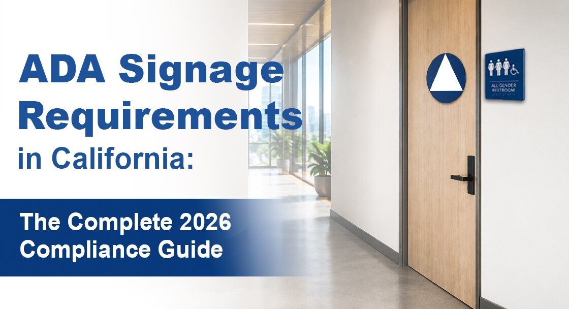
Table of Contents
When it comes to signage, ADA violations are more common than you might expect. Getting interior signs wrong can lead to compliance issues. It also means missing the chance to welcome every customer. It can lead to expensive fines and lawsuits.
In 2020, 50% of submitted ADA sign designs were non-compliant. That’s a huge problem. This guide clears up confusion. It highlights common ADA signage violations and guides how to correct them.
Most sign violations happen because designers and facility managers misunderstand the technical requirements.
But here’s the good news.
Every ADA violations are 100% preventable when you know what to look for.
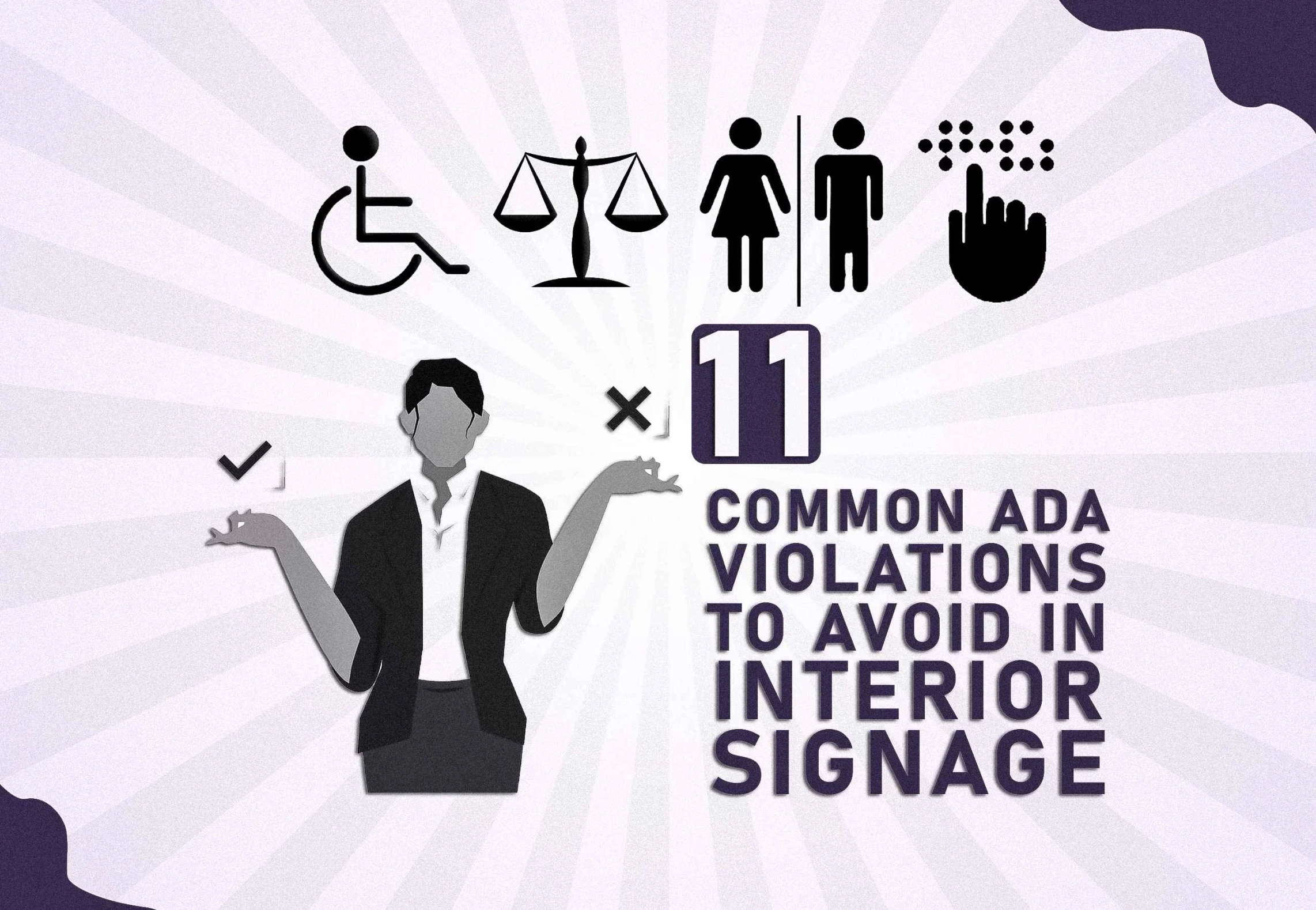
Today, you’ll learn about 11 common ADA violations. These can lead to costly fines.
Let’s dive in.
ADA Violations #1: Missing Tactile Characters or Braille on Permanent Signs
 1")
This violation is about the fabrication and design of the sign itself. It focuses on what the sign must contain to be accessible to blind or visually impaired people.
The Violation:
Permanent room signs, such as restrooms and offices, do not have Grade 2 Braille or raised letters. This makes the sign unusable for people who rely on touch to read.
Why This Violation Is So Expensive:
Blind and visually impaired people need tactile signage for navigation in your facility. Without it, you risk ADA Title III violations and potential discrimination lawsuits.
How to Fix It: The Complete Technical Specification
Grade 2 Braille: Ensure Braille dots have the correct height and are dome-shaped. The spacing between dots and cells must be precise.
Raised Characters: Use uppercase, sans serif letters. They should be at least 5/8 inch tall and project at least 1/32 inch. Character width must be proportional.
Placement: Place the Braille below the tactile text. Leave a small gap between them.
Verification: A certified transcriber must check the braille. If possible, a user should test it too. The sign must be free of sharp edges.
ADA Violations #2: Signs Mounted in the Wrong Place (or Too High/Low)
 2")

This violation is about the installation of the sign. It looks at where to place the sign in the environment. This ensures it is visible and easy to reach.
The Violation:
Someone mounted signs in the wrong location (e.g., on the door itself or on the hinge side) or at an incorrect height. This makes them hard to find and read for people in wheelchairs or those with visual impairments.
How to Fix It: Professional Installation Standards
Height: Place the highest tactile character between 48 and 60 inches above the finished floor. Use a laser level to ensure consistency throughout the facility.
Location: Mount the sign on the latch side of the door, where the handle is. Never place it on the door itself.
Clearance: Keep at least 18″ x 18″ of clear space in front of the sign. This area should be free of obstructions, such as furniture or doors.
ADA Violations #3: Poor Color Contrast (No one can read it!)

This violation is about the sign’s visual design. It examines the colors and finishes that affect readability and glare.
The Violation:
The text and background colors lack enough contrast. This makes the sign hard to read for those with low vision. Also, a glossy finish creates glare, making the sign unreadable.
How to Fix It
Contrast Ratios: Aim for a contrast ratio of at least 4.5:1. For large text, use a ratio of 3:1. Experts suggest a 7:1 ratio for the best accessibility.
Color Combinations: Use high-contrast colors. For example, use black text on a white background. You can also try yellow text on dark blue.
Finish: Use a matte or eggshell finish on all sign faces to avoid glare. Use non-reflective materials for parts people touch. Also, consider anti-glare coatings in bright areas.
Backgrounds: Ensure backgrounds are solid-colored and texture-free to avoid visual confusion.
ADA Violations #4: Decorative or Noncompliant Fonts

This violation is about the typography used on the sign. It emphasizes picking fonts that are easy to read and meet tactile reading needs.
The Violation
The sign uses non-compliant fonts, like script, serif, italic, condensed, or decorative styles. These fonts are difficult to read visually and through touch. They do not meet ADA requirements.
How to Fix It
Font choice: Use simple, sans serif fonts like Arial, Helvetica, or Verdana. All text on permanent signs must be in uppercase.
Character Proportions: Ensure characters have correct width-to-height ratios. The width of the letter “O” should be 55-110% of the height of the letter “I.”
Spacing: Maintain correct spacing between letters and lines to ensure readability.
- Character spacing: 10-35% of character height.
- Line spacing: 135-170% of character height.
Read our guide on how to choose a font for ada compliant signage for answers to the most common ADA fonts questions.
ADA Violations #5: Missing International Symbol of Accessibility (ISA)

This violation is about the absence or incorrect use of the ISA pictogram on signs that should have it.
The Violation:
Signs pointing to accessible features like entrances, restrooms, or elevators lack the International Symbol of Accessibility (ISA). Using a non-standard or decorative symbol is also a violation.
How to Fix It
Placement: The ISA should be on signs that point to accessible features. This includes accessible parking spots, restrooms (if some aren’t accessible), and elevators or lifts.
Size and Proportions: The symbol should be at least 6 inches tall. It must also keep the standard ISA proportions. The stroke width should match the text on the sign.
Color and Contrast: The ISA must be the same color as the text on the sign and have a high contrast with the background. It must be a solid color with no decorative effects.
Avoid Common Mistakes: Don’t use decorative symbols. Don’t stretch or compress the image. Use the correct colors. Always include the symbol on required directional signs.
ADA Violations #6: Pictograms without proper text or Braille
This violation is about the missing text and braille for pictograms. A pictogram by itself does not meet compliance.
The Violation
Signs use pictograms, like restroom figures or stair icons, to convey information. They lack raised text or Grade 2 Braille. This makes them hard to see for people who are blind or have low vision. It can also lead to cultural misunderstandings.
How to Fix It

Visual Component: Use an ADA-approved pictogram. It must be at least 6 inches tall. Ensure high contrast and avoid decorative alterations.
Text Component: Place the descriptive text right below the pictogram. Use an uppercase, sans-serif font. The text must have a minimum raised height of 1/32 inch.
Braille Component: Include Grade 2 Braille below the text. The Braille should have proper spacing and align to the left with the text above it.
Placement: Center the pictogram on a clear background. Ensure there’s plenty of white space. It must not overlap with the text or Braille.
Custom Symbols: If a standard symbol isn’t available, create a custom one for each user group. Always include descriptive text and Braille.
ADA Violations #7: Missing directional signage to accessible features
This violation is due to missing signs that help people find accessible areas in the facility.
The Violation:
The building lacks signs for accessible features. This includes entrances, restrooms, parking, and elevators. As a result, people with disabilities struggle to navigate the facility. These features aren’t “readily discoverable,” which is a requirement of the ADA.
How to Fix It

Placement: Install directional signs at every key decision point. This includes all entrances, hallway intersections, lobbies, and areas where people choose stairs or elevators.
Content: Signs must clearly show directions, like left, right, or straight. Use consistent arrow styles. Include the International Symbol of Accessibility (ISA) where needed.
Installation: Mount signs at a height of 48-60 inches to the centerline. Position them on the right side of the corridor near decision points. Ensure clear sight lines and good lighting.
ADA Violations #8: Temporary or Non-Permanent Signs Misused as Compliance
This violation involves using temporary signs instead of the required permanent ones.
The Violation:
Temporary signs like laminated paper, vinyl stickers, and removable placards help identify rooms and guide people. These materials don’t meet ADA standards. They lack durability, permanence, and correct display of raised characters and braille.
How to Fix It
Materials: Use strong, lasting materials for all signs. Good options include acrylic, metal, or photopolymer plates. These materials can provide the required raised text and braille.
Installation: Mount signs securely on the wall. Use screws, bolts, or strong adhesives for a permanent fit. Signs must be vandal-resistant and unable to be easily removed.
Compliance: Make sure the materials resist typical weather and cleaning agents. They should also have tactile features that ensure accessibility.
ADA Violations #9: Wrong Braille grade or spacing errors

This violation involves the wrong use of Braille on a sign. It focuses on the grade and spacing issues.
The Violation:
Signs use the incorrect braille system (e.g., Grade 1 instead of Grade 2), or the braille dots are improperly spaced. This makes the braille hard or even impossible to read. So, the sign is not accessible to blind people.
How to Fix It
Braille Grade: Use Grade 2 braille only. This is the contracted braille system that is the standard for all permanent signage.
Spacing: Ensure all braille spacing is precise, including:
Dot-to-dot: 0.090 inches horizontally and 0.100 inches vertically. This is the distance between individual braille dots within a single character. It is measured from the center of one dot to the center of the next dot.
Cell-to-cell: 0.241 inches. This is the gap between complete Braille characters.
Word-to-word: 0.241 inches. This is the blank space between complete words in Braille. It creates a consistent spacing for word recognition.
Text-to-braille: A consistent gap of 3/8 to 1/2 inch. – This is the vertical space between the bottom of the raised visual text and the top of the braille dots below it
Quality Control: Use certified braille transcribers to ensure accurate translation. Verify dot height with calipers, and check for consistent, dome-shaped dots. Use templates and digital measurements to check spacing before full production.
ADA Violations #10: Non-Glare Finish Violations
This violation relates to how shiny a sign’s surface is. A shiny surface can create glare, making the sign hard to read.
The Violation:
Signs have a glossy, reflective finish that creates glare under various lighting conditions. This glare is a big issue for people with low vision, older adults, and those sensitive to light. It makes the sign hard to see.
How to Fix It

Surface Finishes: Use non-glare finishes as the industry standard. The best choices are matte, eggshell, or satin finishes. Anti-glare coatings can also be applied to existing signs to fix this issue.
Material Selection: Pick materials that are low-glare. Good choices are matte acrylic sheets, textured acrylics, and brushed or anodized metals with matte finishes. Avoid polished metal, glossy acrylics, or glass.
Testing: Test the signs in different lighting. This way, you can check if they stay readable and glare-free. You can use tools like luminance meters to measure reflected light. It’s best to get feedback from people with vision impairments.
ADA Violations #11: Improper sign size vs. viewing distance
This violation concerns the sign’s text. It’s hard to read because the character size, height, and spacing are wrong.
The Violation:
The letters on the sign are too small for the distance from which they are meant to be read. This makes them difficult for people with low vision or older adults to read. Wrong spacing between letters and lines can make the sign look cramped and confusing.
How to Fix It
Character Height: Use a size-to-distance chart to determine the minimum character height. For example, a sign viewed from 10 feet away requires a minimum character height of 1 inch. For tactile signs, the maximum height is 2 inches.
Measurement: Measure character height on uppercase letters without descenders (e.g., I, H). The measurement must include the raised portion of the tactile characters.
Spacing: Ensure correct spacing between letters and lines.
- Character spacing: 10-35% of character height.
- Line spacing: 135-170% of character height.
Verification: Check the sign’s legibility. Test it with users at different distances and angles. Don’t forget to include wheelchair height. This way, everyone can read it.
Bonus Tip: Neglecting Sign Maintenance
This violation involves not keeping a sign in good condition. Over time, this can make the sign non-compliant and hard to access.
The Violation:
Signs are damaged, faded, or otherwise in poor condition due to a lack of maintenance. A damaged sign with worn tactile characters or missing braille dots does not provide accessibility. This can lead to the same legal penalties as a new non-compliant sign.
How to Fix It
Maintenance Program: Establish a proactive maintenance schedule that includes regular monthly inspections. These inspections should check for damaged tactile elements, loose mounts, dirt buildup, and old information.
Professional Audits: Have an ADA expert do an annual audit. This keeps all signs compliant with current rules. It also helps plan for replacing old signage.
Immediate Replacement: Fix any signs with worn-out tactile elements, missing braille dots, or mounting problems right away.
Documentation: Keep thorough records of all maintenance work and updates. This shows your commitment to staying compliant.
Final Thoughts
ADA signage isn’t about avoiding penalties. It’s about building inclusive environments where everyone can feel safe and informed.
If you’re unsure whether your signs meet ADA requirements, it’s time for a review. Fixing these common violations is simple, and it makes a big difference.
Our interior signage provides exact manufacturing requirements, approved materials lists, and installation guidelines with 100% compliance. Contact us for more information.
ADA Violations FAQs
Q1. What is the most common ADA signage violation?
One of the most common violations is missing tactile characters or Grade 2 Braille on permanent room signs. Without these elements, people who are blind or visually impaired cannot independently navigate a facility.
Q2. What type of font is allowed on ADA-compliant signs?
Permanent ADA signs must use simple, sans serif fonts in uppercase, such as Arial, Helvetica, or Verdana. Decorative, script, italic, and condensed fonts are not compliant.
Q3. What’s the difference between Grade 1 and Grade 2 Braille?
Grade 1 Braille is uncontracted and spells out every letter, while Grade 2 Braille uses contractions and is the ADA-required standard for permanent signage to save space and improve readability.
Q4. Are temporary signs allowed for ADA compliance?
 6")
Temporary paper or laminated signs do not meet ADA standards because they lack durability, tactile characters, and proper Braille. Permanent materials like acrylic, metal, or photopolymer are required.
Q5. Do ADA signs require maintenance?
 7")
Yes. Damaged, faded, or worn signs can become non-compliant. Regular inspections, cleaning, and immediate replacement of damaged signage help maintain compliance and accessibility.