Have you ever felt overwhelmed in a hospital or airport, unsure where to turn? You are not alone. Poor signage creates confusion, causes delays, and leads to frustration. Interior wayfinding signs in simplifying spaces and serve as invisible helpers in modern buildings.
Table of Contents
But what if navigating a complex building feels easy?
Good interior signage is clear. It reduces visual clutter and helps people feel confident in new spaces.
At ALTIUS Graphics, we get it. We design and build indoor signage systems. Our goal is to guide users and improve everyone’s experience.
What Are Interior Wayfinding Signs?
Interior wayfinding signs are key visual tools. They help guide people through indoor spaces.
Interior wayfinding signs answer three key questions:
Where am I?
Where do I want to go?
How do I get there?
They’re not about pointing arrows. These signs include
Identification signs: Room 205,
Informational signs: “Patient Registration,”
Directional signs: “Elevators,” and
Regulatory signs: “No Smoking.”
Each position creates a clear path for users as they navigate your space.
How to Simplify Interior Navigation (and Why It Matters)
Picture a crowded hospital, a large shopping mall, and a lively office building. Good signs reduce the mental effort to move through the space. They offer clear cues and create a simpler, cleaner layout.
A key fact: The Sign Research Foundation found that good signage can cut wayfinding time by 40%. That’s less confusion, fewer late appointments, and happier visitors.
How Wayfinding Design Simplifies Complex Spaces: From Chaos to Clarity
Want to make your complex space easy to navigate? Follow this step-by-step strategy:
Spot the Decision Points: Where do people pause and look for guidance? Think of entrances, elevators, and intersections.
Use a Hierarchy:
Put large signs at key points, like which floor.
Use smaller signs for details, like room numbers.
Stay Consistent: This is key! Use the exact same fonts, icons, and colors throughout the entire building.
Go for progressive disclosure: Only show the information people need at that moment.
This approach cuts clutter. It helps people focus on moving forward instead of searching for missing information.
Before & After: Case Study Interior Wayfinding Signs
Before Installing Wayfinding Signs
Building spaces often have signs with mixed fonts. They may be small and in an unsuitable location. Confusing arrows can also add to the chaos.
After Installing Wayfinding Signs
Signs in clear zones help with navigation. They use bold type, color-coded paths, and easy-to-read icons.
The result: A 30% drop in questions at the reception desk. Plus, people move fast through the space.
Design Elements That Actually Work
If you are ready to create wayfinding signs, then focus on these core elements.
Typography & Contrast
Choose clean and simple fonts. Like Helvetica or Frutiger.
Use strong contrast: Ensure a 70% difference between text and background colors. This helps with visibility.
Larger fonts. Help seniors and people with low vision.
Color Coding
Assign specific colors to key areas. For example: blue for emergencies, and green for general areas.
It helps users make immediate connections between colors and directions.
Universal Symbols
Icons are global and help people who speak different languages. Tactile signs with Braille make navigation accessible for everyone.
Material Matching
You should select materials that match the space.
Modern Office: Brushed metal, matte vinyl, or acrylic work well.
Eco-conscious space: ALTIUS Graphics offers eco-friendly modular systems that support sustainability.
Tailored Wayfinding for Different Spaces
Different builders create buildings with varying qualities. Your wayfinding needs to fit your specific environment.
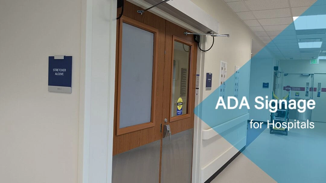
Hospitals and Healthcare Facilities
Easy navigation for patients who might be stressed or elderly.
Clear emergency routes and readable fonts are not negotiable.
ADA-compliant signs with Braille and raised letters are a must.
Interior wayfinding signs do more than guide; they welcome everyone.
Universal Design Principles
Consistent placement at readable heights
High contrast and large letters
Multilingual support in diverse communities
ADA and Cognitive Accessibility
Tactile signs, Braille, and raised letters for those with visual impairments.
A clear and predictable flow for users with memory or learning challenges
Consistent sign patterns reduce anxiety and build confidence.
Longevity, Flexibility, and Green Solutions
Your wayfinding system is an investment. Make it last.
Ongoing Optimization
Regular reviews ensure your layouts stay up to date
Clean signs reduce confusion and look professional
Modular Flexibility
Update information without replacing entire signs. Save money and reduce waste. It’s a win-win situation.
Sustainable Materials
Use recycled acrylic, aluminum, or wood products whenever possible.
Success Stories That Prove the Point
Need proof? Here’s how real businesses transformed their spaces.
Hospital Navigation Overhaul
Harris County Ben Taub Hospital, Houston, Texas, collaborated with ALTIUS Graphics. They ordered several types of signage: 1. Interior wayfinding signage 2. Room identification signage 3. ADA and Braille signs for walls and doors 4. Vinyl decals for doors in new colors and fonts
The result? Wayfinding-related questions dropped by 30%. Emergency staff even saw their response times improve by 12%. That’s real impact.
Hospital Navigation Upgrade
Union General Hospital, Louisiana also collaborated with ALTIUS Graphics. They ordered and installed interior Braille room identification signs with backer plate. Surveys showed a quick jump in patient satisfaction.
Final Thoughts
Interior wayfinding signs in simplifying spaces play an important role. They are powerful solutions that make complex spaces easier to understand and navigate. They enhance accessibility, minimize confusion, and facilitate how people navigate your building.
Running a hospital, retail space, or office? We can help you reduce clutter, enhance inclusivity, and showcase your brand.
Ready to simplify your space?
See how our sign design reduced wayfinding questions by 30%. Can’t find the answer you’re looking for? You can call us at (832) 500-5160 or contact us.
FAQs Interior Wayfinding Signs in Simplifying Spaces
Q1. What makes interior wayfinding signs effective?
They simplify complex spaces by guiding users efficiently using symbols, arrows, and clear messaging aligned with spatial layouts.
Q2. Are interior wayfinding signs ADA-compliant?
Yes, when designed with tactile letters, proper contrast, braille, and accessible placements, they comply with ADA standards.
Q3. Can wayfinding signs be branded?
Absolutely. ALTIUS Graphics designs signs that reflect your organization’s brand while maintaining clarity and functionality.
Sidd is a passionate content creator at ALTIUS Graphics, where signage, design, and storytelling come together. Inspired by bold visuals and impactful branding, he writes with clarity and purpose, covering everything from ADA-compliant signs to eye-catching vehicle wraps. Through every blog, Sidd shares insights that help businesses transform spaces and elevate their brand visibility with confidence.